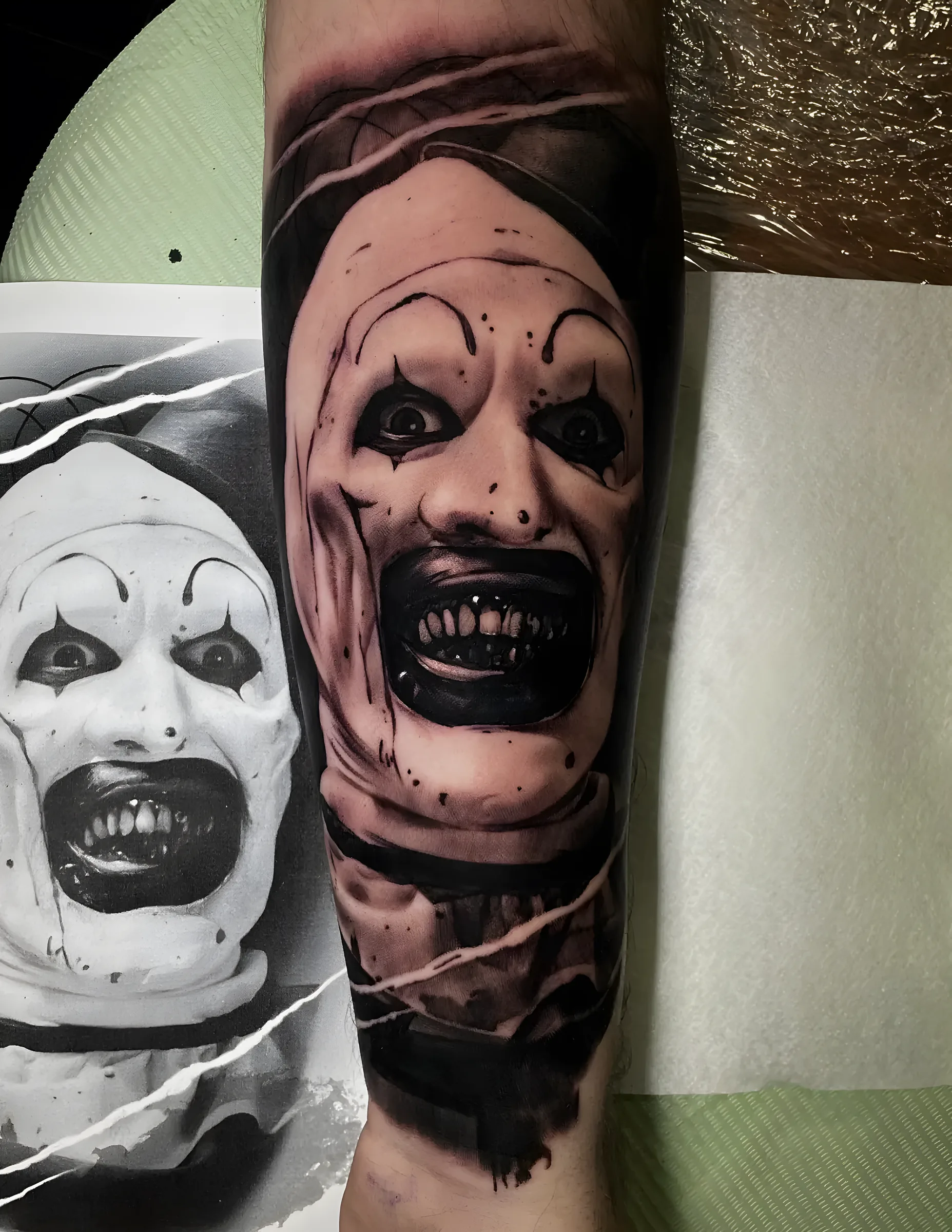
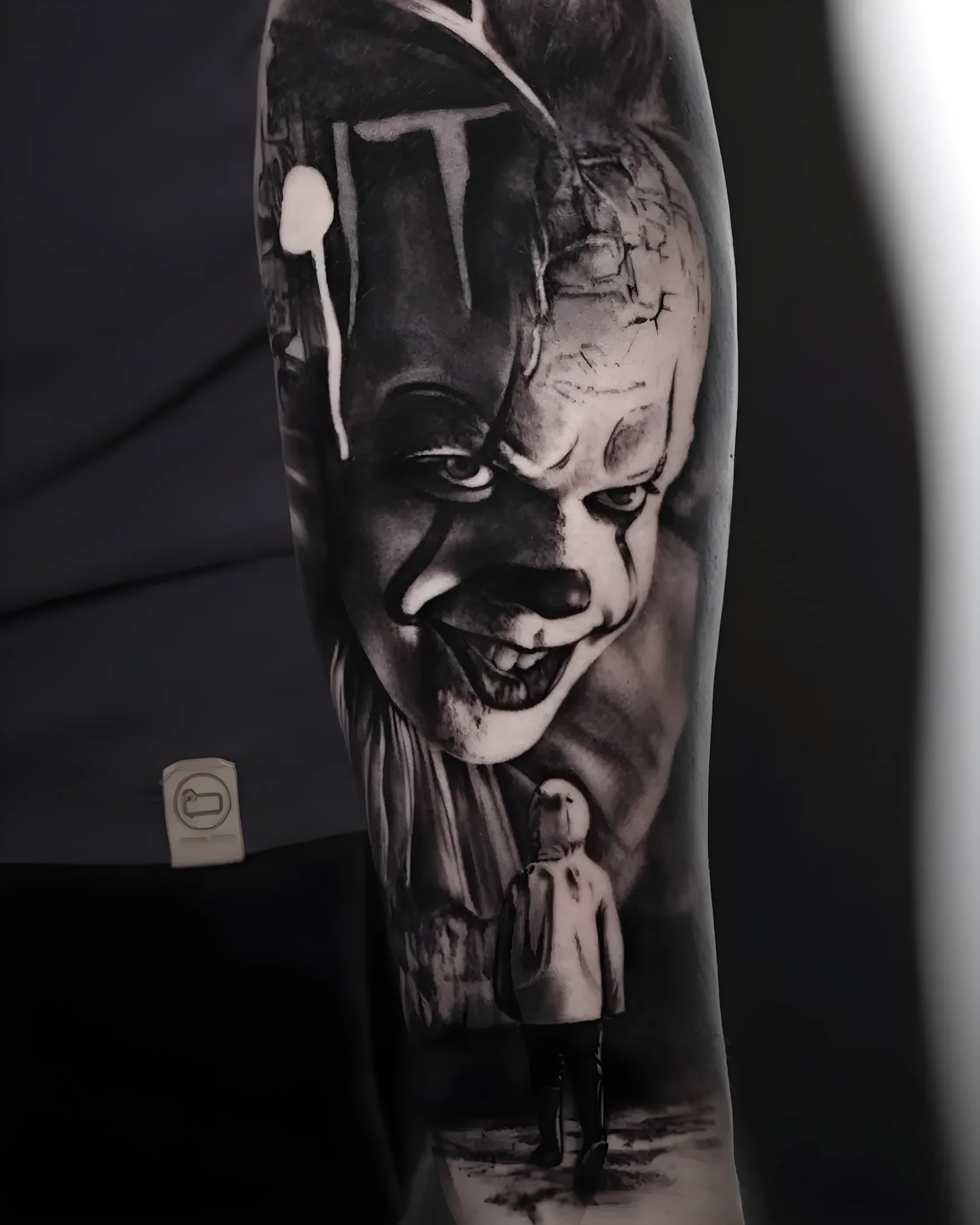
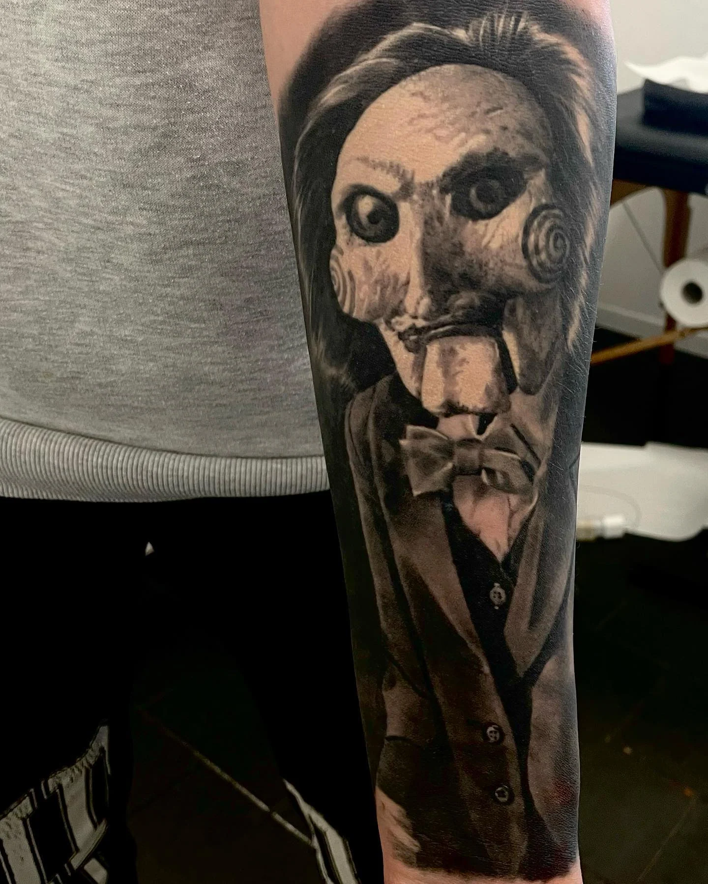
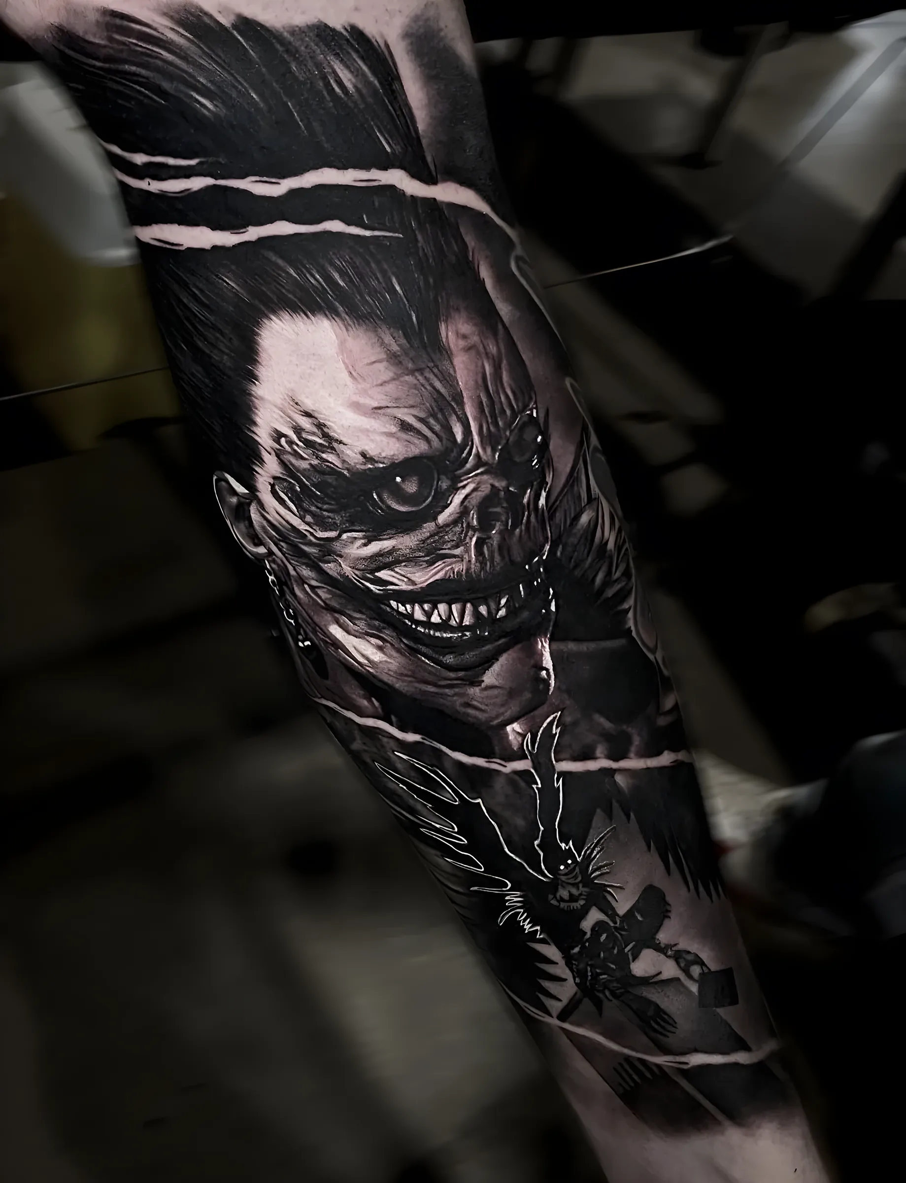
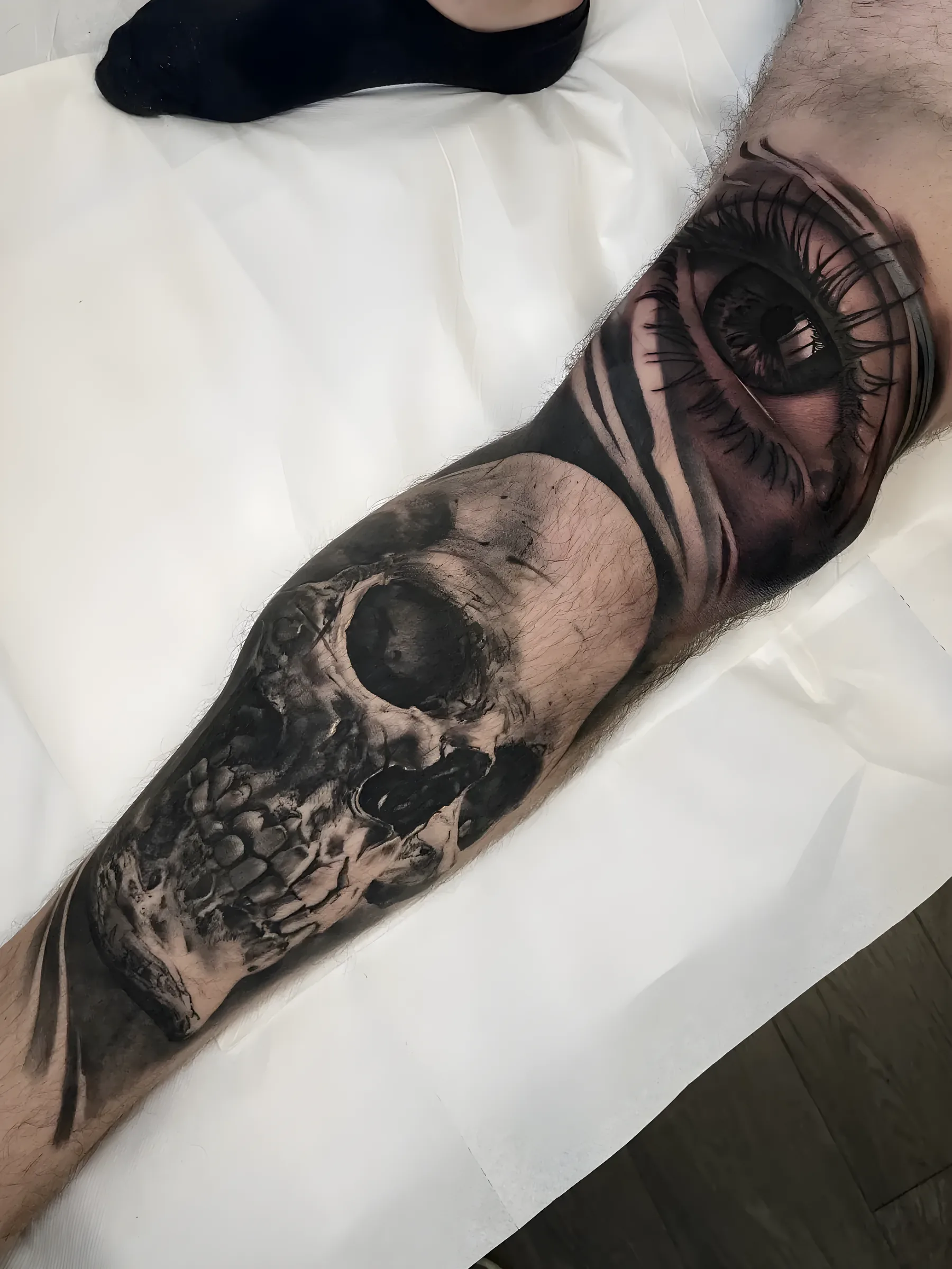
Horror is where black and grey realism is at its most comfortable. The whole genre is built on contrast, deep shadow and skin that is not supposed to look healthy.
It is also forgiving in the best way: a horror piece is allowed to be pushed darker than a portrait of a person, which means it will still read hard from across a room in ten years.
Generally yes, because it is built on stronger contrast. A face has to hold subtle mid greys to stay a likeness. A monster does not.
Yes, and it is one of the formats that works best as a themed sleeve because the characters share a visual language.
That is usually the right call. Screen horror is lit for a camera. Skin needs the contrast pushed further to read at a distance.
They are drawn from reference, like any portrait, but composed for the body they go on rather than traced from a poster.
Requests go straight to Federico, not to an agency inbox. He answers from his own address.